
Getting The Most Out of Every Scene2/7/2023 Up until recently I feel that I've been dragging my feet in terms of committing to building out this project in a serious way. I've had long-term plans for it but nothing else has really been set in stone besides some crucial story elements. I've started to work on this again consistently and really have been pushing myself to invest more of my time into building out this game that I love so much. The opening scene, enhancedStep 1 This is where we were at when I wrote the previous blog post. These lights use what is called additive blending. This means we take color data (red, green, blue, alpha) and add the values of our new colors to it. So a full white light would turn those values to (1, 1, 1, 1). 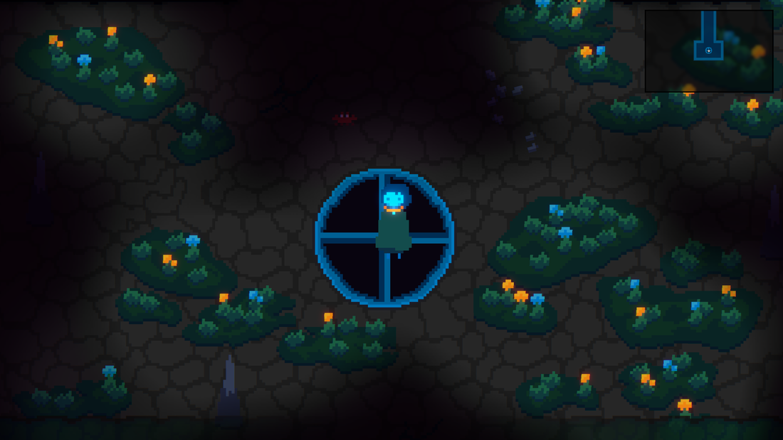 Step 2 Lights have been changed to be a bit more dim and a lot more colorful. These lights use normal blending. Which does not do a whole lot to make the scene feel vibrant. Still seems kind of muddy. 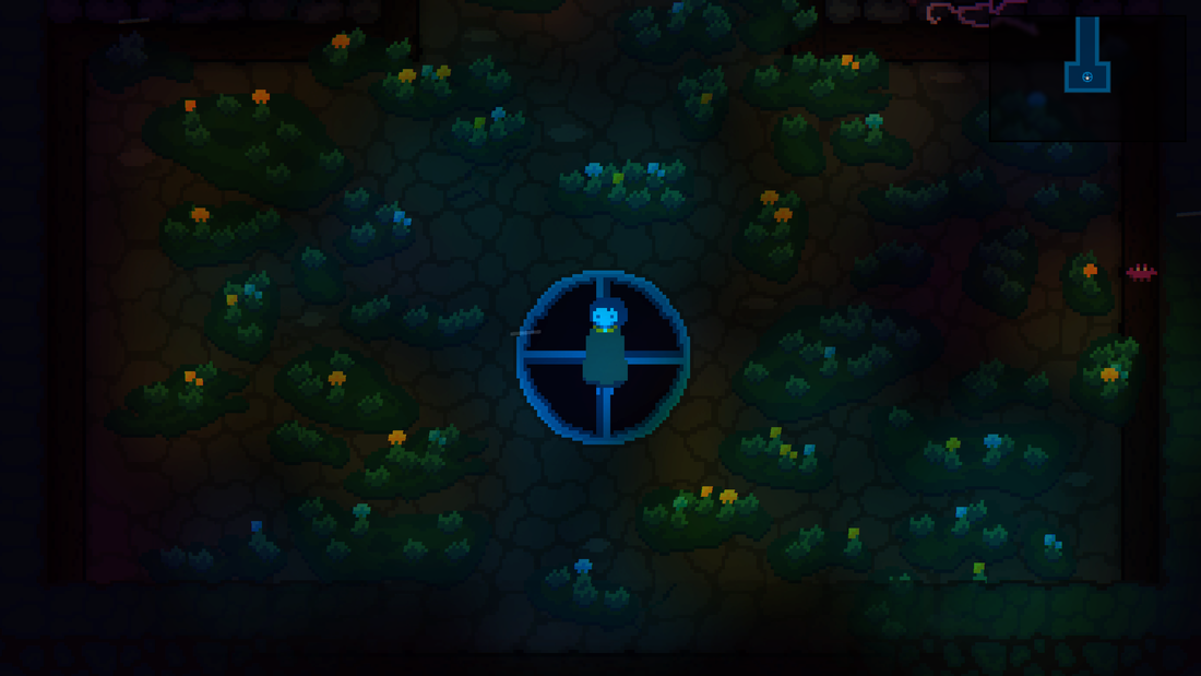 Step 3 We apply a bit of over-exposure to the lighting and then a tone map on top of that. There is also parallax foregrounds (see the rock on the bottom right). The scene now is vivid and significantly less muddy. 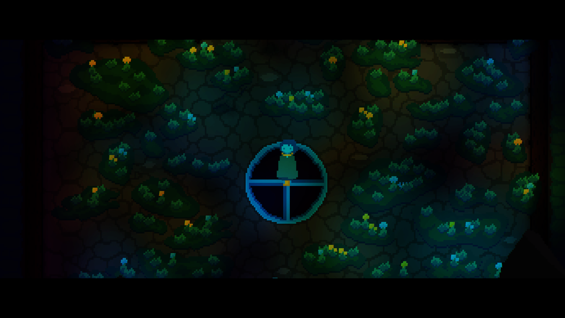 Let's talk about depthDepth is a fascinating topic in video games because there are 3D games that feel flat and there are 2D games that feel like they are 3D. Perceived depth is an interested topic because there are so many ways to communicate this information to the player. Color and focus Using our primitive monkey brains we can derive that focusing on shiny things gives us dopamine. Looking at bland, boring, not shiny things steals away that dopamine. When building a scene you just have to think about your audience, in this case, Neanderthals. An easy way to determine how washed out a scene is, is to apply extreme contrast to it. First we'll look at the original art style and use this technique. 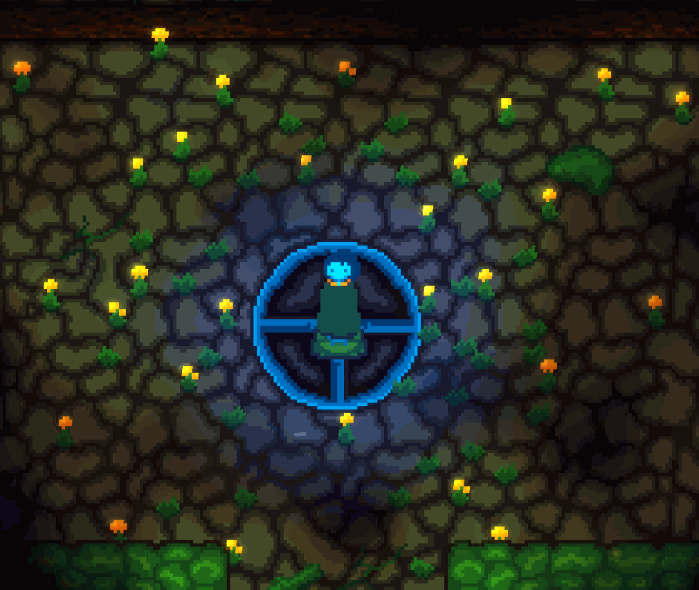 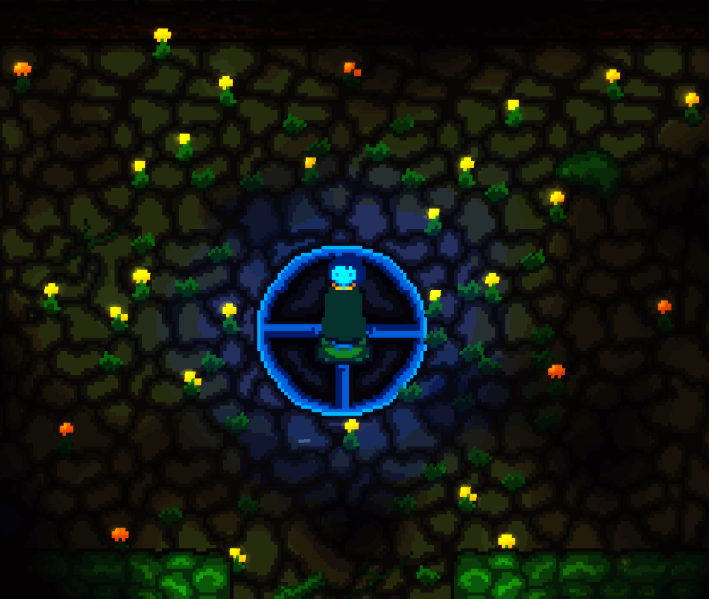 It's clear that a lot of the screen is bright and extracting a sense of depth from this scene is very difficult. The bright flowers help but they don't save the day here. Now we'll look at the new art style (including the tone map) and ideally, we can quickly perceive depth purely from the colors in the image. 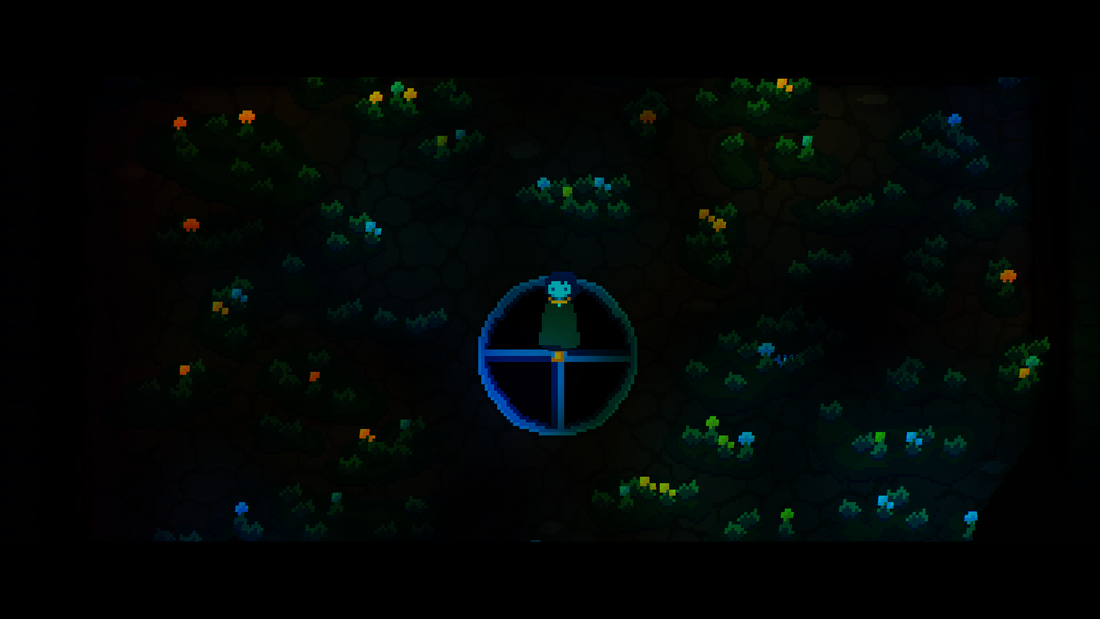 Looking at the high contrast image, we can see that everything except the background is fairly visible. This means that players will be able to quickly derive information from a scene. Foreground When things are really close to us, they appear larger, and sometimes out of focus. They also appear to move faster than things that are further away. 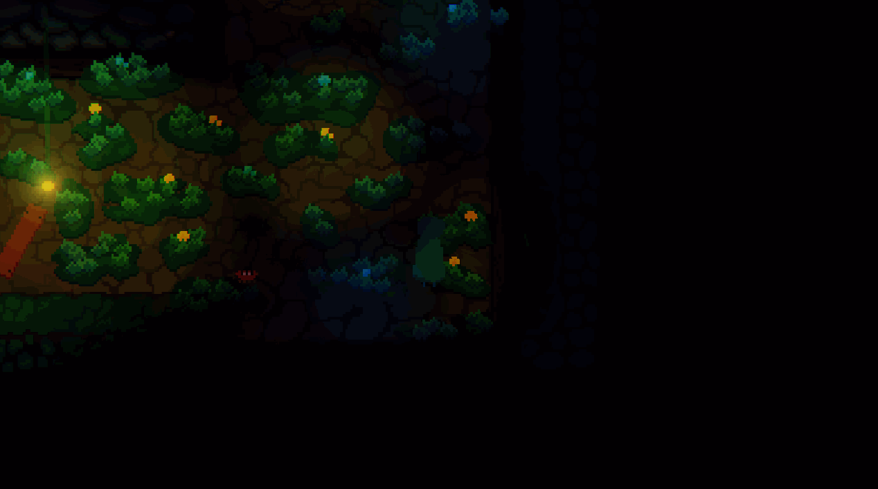 Following a visual frameworkBuilding a set of rules to follow when it comes to building content is very important. It allows you to work within a little box that feels nice and comfy.  Game Maker Studio's new audio effectsUp until recently I've always exported two versions of every sound effect. One with reverb, and one without. It's a huge pain in my little butt and the new audio effects are a fantastic addition to my toolkit.
0 Comments
Leave a Reply.AuthorI've spent 12+ years learning/working around game development. I love all sorts of interactive media. I'm also a mediocre musician. 
|